
This is keeping with the hand rendered type but I think this will become more legible than the other one when imitated.

Just like I did with the previous type.I first did a single line type in the same style but yet again it was not effective.

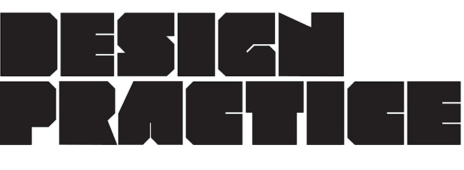
This is a more resolved version of what I want.I'm not 100% sure about the shine of the letters.But I'm going to try and vector it and see how it turns out.

I think this came out quite successfully but I'm beginning to fear how serious this would be took with a logo like this.I want the audience to be confident with what I'm talking about.I want them to trust me showing them around etc.
I'm going to try and see how it looks with delivery e.g dvd,webpages etc. Before I completely abandon the logo.


Although these were done quite quickly and are not final I'm really beginning to think this logo wont be taken serious enough.
I think I need to look at more methods on how to deliver it with a more mature tone of voice.
No comments:
Post a Comment