Tuesday 15 December 2009

Collection 100

Research proposal.

The subject matter of this new brief is..
Ian Curtis

Possible categories and interrelationships I can look at will be...
Music,media,Parenthood,suicide,the music industry,

Research Processes will include..
Primary methods - Interviews with people on opinion about his music
Do they know who he is
Do they know about his life not just his music.
Possibly photography (He's dead so its going to be abit tricky)

Secondary methods - His music and lyrics and pre recorded interviews.

Who and where will I research?

Primary methods.
Leeds/manchester/birmingham public - People who would've been a teenager in the late 70's
and friends

Secondry methods
Lyrics,books,blogs,music forums

Research processes will include...

Photography of his house in 77 Barton Street, Macclesfield, Manchester to get a sense of his surroundings and what he
was faced with everyday he walked out the front door.
Interviews with people of leeds and birmingham and manchester,where Ian was from
to get some knowledge out of people.See how much they know about this almost forgotten legend.
See if his name still lives on though music influences and have people had the same life experince as Ian or Debrah (His wife)
Music recordings from live shows back in late 70's/early 80's
Documentary footage
book about his life.


Visual Language - Lights


Moving on from the last session where we photographed lightswitches.
I thought it would be interesting to literally move on and go on to photograph light/light sources.
This followed the rule from last session which was to photograph a single light source.
Thought this would be an interesting logic because things such as lights have single lightswitches.
eg.we turn on our whole kitchen using one lightswitch which powers one light.
So I went outside the college building (This was a rule) and went round hunting down light sources.
In this festive time of year it was surprisingly difficult finding a single lightsource because there's loads of christmas lights about the city.
These are the ones I think worked particularly well


I think these worked well because they were lightning something up in the background but they were lighting them subtlety.
So I loved these because it showed the function of lights.

Visual Language-Light switches

I worked with Gemma Byrne for this session and we was given a object to photograph.But we had to choose some rules
when photographing them.
Our rules were.

Only photograph switches with one switch and one switch alone.
The light switches had to be turned on.
and the switch had to be in the middle of the photo.
This made them more hard to hunt down and they always in sneaky corners.
It became an obsession
and we was not going to drift away from our rules.
As a result of this
we never got the full amount of photos we had to take.
But here are the ones we did manage to find.

They are not visually appealing and are really boring to look at but what I loved about this breif was the logic behind it
more than the visual. Although I do think they work as a sequence purely because of reputation

Friday 4 December 2009

OUGD102- What If


"What if a group of graphic design students get together, and decide to solve a problem?
Based on your common interests, research and knowledge, you must establish a “problem” that affects some sector of the general public in Leeds.
You must develop logical, original and adventurous research lines of enquiry in order to justify the relevance of the “problem “ which should inform a range of solutions.
The solution(s) must be resolved, designed and presented in the public domain and recorded appropriately."

This is the first brief in the module.
We were put into groups and chose a problem we could solve.
it had to be for the leeds public
my group consists of Josh,Brady,Kim,Dutch and myself and our problem was originally drugs at leeds festival.
We put together a questionnaire to ask people who had been to leeds fest how comfortable they felt with people doing drugs in the festival and how it should be policed.It was then brought to our attention that people travel from all over the UK to attend the leeds festival, therefore it was not focusing on the residents of leeds.
So we went back and looked at the club scene in leeds and how easy it is to use drugs in the clubs.For primary research two of our teamates went to a nightclub to observe the drug scene for primary research. Whilst at the club they noticed a very high usage of a drug named "Mcat".They saw a few people taking the drug and began asking them questions as the users's "experience" grew.My job was to find out as much secondary research as I could about the newly popular drug.
"A stimulant drug with effects similar to MDMA producing euphoria, alertness, talkativeness and feelings of empathy. It can also cause anxiety and paranoid states and risk overstimulating the heart and nervous system to cause fits. Severe nosebleeds have been reported after snorting."Upon research I found out that the drug is only 2 years old and is being sold as plant food.It's what is known as a legal high. People take it as a drug because its legal and know that if they are caught doing it the law is powerless and it has the same effect as an illegal drug. They also think that just because it has a legal label slapped on it people are thinking it is safe.
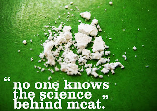
Because it's such a new drug it was very difficult to find some hard evidence so we could only go on what we know.We found out that it hasn't even been researched which is why its not illegal.
So we decided that our new problem was;


We we all given jobs to come up with how we were going to do this and research jobs to do along with incase we found something new about the drug as we went along.
Because not even scientists know alot about this drug we cannot say "Don't take this drug because "x" and "x" will happen to you" and the people taking them are not going to stop taking them.
So we thought we could highlight the fact that now one knows anything about it.
We all went away and came up with how we would publicize this problem.
This is my design process

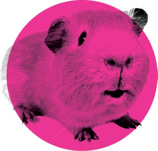
I chose the image of the guinea pig because people don't know what is in the drug so everytime they take it they are being "lab test guinea pigs"

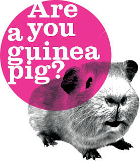
"Are you a guinea pig?"
I think it's good to ask questions when trying to inform/persuade because it puts the reader at a awkward/uncomfortable position and depending on how striking that question is,it could be a question that bugs them and makes them want to find out more.


In this design i have chosen to cut up the circle around the guinea pig because the problem with Mcat is a broken matter.
It has the same effects as MDMA but is legal.
I have also chose to emphasize "Are You" by making it black and the rest of the question white.
As well as working with the black and white image of the guinea pig,the black type emphasizes the point and makes the question more personal.

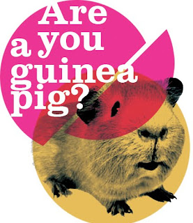
I've included a second circle for the animals fur.
I love circles as its simplicity at its best.
simple shapes and easy.
I love the way the two colours have bled into eachother in the middle.
Is a piece of design that "writes itself"


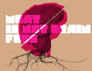
Mcat is being sold as a plant feeder and it even says on the packaging that it's not for human consuption.Drugs in general effect the brain so I thought it'll be good to show that it's for plants not humans by making roots come out of a human brain.
Of course this won't really happen and it is slightly unrealistic but I think it gets the message across
Here is one of my mac visuals:


Thursday 5 November 2009

Monday 26 October 2009


An alphabet for Tom Bates.
This alphabet was made to communicate Tom Bates as a laid back yet sentimental chap.I chose bodoni because of its easy to manipulate serifs.The two words I wanted to concentrate on visually were Contrast and subtlety.But as a person I wanted to communicate tom as Laid back yet sentimental.To me, sentimental means an emotionally delicate thing so I made the serifs more delicate by making them thinner.Laid back is a word that is contrasted by sentimental.Sentimental things you have a place for it and its all tidy and put away safe.Where as laid back means someone who is care free and goes with the flow.With this contrast in mind I made some of the serifs more rounded and emphasised the tails by making them more round.I also gave the "g" more flow by exaggerating the loop.I felt like this didnt communicate Tom himself but more somebody who is laid back yet sentimental.I wanted to hint "Tom" in my alphabet.I remember in the interview I asked him who did he like typogrpahically.He mentioned Si Scott and instantly i painted an image in my head of these care free,flowy swirls which Si is most recognised for.
With these all combined I think I have made a successful alphabet,communicating Tom.


OUGD104 a visual vocabulary 20/10/09

We was told in last weeks session to collect boxes.They could be different sizes but they should be no bigger than a shoe box.

I came home and looked for boxes.And came to conclusion that:I have no boxes.

So I asked mates and flatmates for any spare boxes and collected about 3-4.This ranged from a small popcorn box and a pizza box.In this weeks session we all brought in our boxes and was told we had to use these boxes and black card to form a letter.We were working with perspective and we were given a view finder to get the right perspective.As a group we all decided that the letter "a" in helvetica would be challenging and fun to do.

As soon as I heard what we had to do I thought of Daniel Tobin Smith; a photographer who works with perspective (Below)


This seemed very similar to what we were doing.

This is what the result looked like from an angle.As you can see.Because of the way the contours of the boxes are being photographed the letter looks distorted.
But look at it from the viewfinder and you can make out the letter.This was a interesting activity because we was working with 3dtype instead of type printed on a 2d surface like we are used to.So it was very different.

Tuesday 13 October 2009

Alphabet Soup.
TYPEFACE
information up soon


Alphabet Soup.
We were asked to manipulate an existing typeface based on a selected word.My word was "EXTEND".So my job was to communicate the word extend.As soon as I heard the word I wanted to stretch out the word and literally extend it. But I thought that was an obvious approach.I wanted to dive deeper into the word and find out the true meaning.I never wanted to take it too literal and stretch out serifs.I wanted subtlety.I researched the word and came up with many definitions;
1. To open or straighten (something) out; unbend
2. To stretch or spread (something) out to greater or fullest length:
3. To enlarge the area, scope, or range of.
I found these meanings,again,too obvious and literal.
I was rattling my brain trying to come up with a subtle meaning which will still communicate extend.
And then I remembered my former college tutor's wise words.He used to always ask me if I could extend on my work,meaning,could I push it further and see it evolve into something more.So I switched personas with Robert Beasly.The creator of the typface Iwasworkingwith-Clarendon.I asked myself.If I was Robert Beasly how would I push thistypefacefurther.So I went about manipulating the typeface subtly to communicateextend.Whilst in the proecss of manipulating the typeface I got caught up in it and ended up making it look like a completly new typeface.Which is something we weren't allowed to do.So I went back to the "literal" sense of extend.But I never wanted to stretch out the letters so I thought of many other ways things can be extended. Machinary was drawn to me. Things being extended mechanically.So I decided to go with that approach. Pieces of machinery have to be accurate other wise they fail the job they are made to do.So to contrast against this accuracy/ techincal side.I hand rendered it and make the lines imperfect rather than draw up an accurate,crisp blueprint like technical drawing.

Monday 12 October 2009


A-The anatomy of type.
The anatomy of type has just recently crept up on me.
I never used to appreciate the process and the craft of making a typeface.I never saw the big deal about it and took it for granted,possibly due to being brought up in a world with computers and perfectly rendered type was only a button away.It was only when assigned a type designing brief that I started to appreciate it fully. The long,sleepless hours and shear craft of each letterform.


C-Creative Impulse.
My favorite thing about design is freedom and possibilities.I love having big ideas and watching them grow from a doodle on a piece of paper to something like a 3d large scale wood cut out of a designed typeface.


T-Tea.
If tea were an alchoholic beverage I would be drunk constantly.I need tea to function,and I think most of my blood and bodily fluids is tea.

Followers

About Me

My photo
Simon Cherry.Im 19 and I practically have a mortgage.I'm currently studying a BA hons in graphic design at leeds art college.I like the simple things in life.If tea were an alchoholic beverage i'd be off me face constantly.Buy me a pint and i'll be your best mate,Honest. The development process and journey of graphic design is my obsession.