Wednesday, 19 May 2010

Get Lost bag in situ.


Bag designs cntd

This is what the bag would look like with the design printed onto it. I love how versatile the logo is and works on any format.
here are a few alternative designs.


Monday, 17 May 2010

BAG DESIGNS.
One of my solutions is a "welcome" bag given to new students who are new to leeds and want to "get lost" in the city and learn about their new surroundings.
Inside the bag would contain.

Booklet: Contains information about whats going on in Leeds and how to keep up to date complete with checklist of bars and places of interest.
Disposable camera so you can take photos of places of interest you would want to remember. Also whenever you see a place on the checklist cross it off and take a photo of it so you remember where it is for future reference.
A few designs for the bag:


Monday, 10 May 2010

TONE OF VOICE.

Tone of voice is very important when it comes to design. It can comAdd Videopletely mislead someone and change the context. If a swear word is written in harsh,bold,heavy type it sends out the message of anger,rage etc but if written in a more "inappropriate" typeface it may make the viewer question the context of the message.

With a phrase such as " get lost " its hard not to think of it in a negative manner. It's used in a rude way and that is what people are used to so they associate " get lost " as " Go away" I was starting to question my message because it may be a harsh way to welcome the first years but looking back at the way I've approached it I think I've managed to soften the blow.


"Using a script font to soften the blow"


I like the layout of this one. The swirls and loops of the "G" loops around and forms the l and it almost looks natural


Although I prefer this one because it sits better to me.


"Text in circle"

The swirls of the "G" follows the natural shape of the circle in which it sits in.
I can see it sitting in websites,blogs etc better and its perfect for stickers.


Colour also has an impact on how we read messages. Harsh colours could give out an angry message so I'm going to use softer colours.

while experimenting with colour I picked this one out because I think the light blue softens the blow yet the grey background also adds a hint of seriousness. I think the other colours I had looked childish and may seem quite patronizing to the audience.

Tuesday, 4 May 2010


This is keeping with the hand rendered type but I think this will become more legible than the other one when imitated.


Just like I did with the previous type.I first did a single line type in the same style but yet again it was not effective.


This is a more resolved version of what I want.I'm not 100% sure about the shine of the letters.But I'm going to try and vector it and see how it turns out.


I think this came out quite successfully but I'm beginning to fear how serious this would be took with a logo like this.I want the audience to be confident with what I'm talking about.I want them to trust me showing them around etc.
I'm going to try and see how it looks with delivery e.g dvd,webpages etc. Before I completely abandon the logo.


Although these were done quite quickly and are not final I'm really beginning to think this logo wont be taken serious enough.
I think I need to look at more methods on how to deliver it with a more mature tone of voice.

BRANDING|get lost logo.

I've been looking at logotypes and branding for this brief and the key word that I'm sticking with is simplicity.
I don't want to too clever with this and i want it to be kept nice and simple so it becomes more versatile in terms of where I can put the logo i.e bags,websites etc.


I'm looking to be light hearted with this and not be too serious but give an educational message at the same time.I was drawn to this hand drawn type and I loved how it was simple,laid back and done by hand.The loops in the type suggest laid back and relax.I want to use flat colours though.


This is my initial response.I tried a single line "get lost" but in the same style which proved to be not so effective.


I must keep it consistent and make the letters join up.My first fears are if when I fill this in will it lose legibility because some of the joints may become invisible.

Monday, 26 April 2010

Speaking From experience.
Produce a range of graphic products that make a statement,comment,observation and/or give advice about your experience on your first year of this course.

As soon as I read this brief I had a ton of ideas come flooding in .Who better to do this than people who have actually gone through it themselves. Before I moved to leeds I looked on websites such as youtube and peoples opinion of the city.All i had to go on really was a youtube video about Leeds met living which was no use to me really.So when I arrived in Leeds I ended up getting lost so many times which for new people to leeds could be really dangerous.I myself was mugged because I never knew where I was and looked lost.once you have become comfortable with your new surroundings and know where things are and how to get home safely you wont become an easy target and you'll begin to feel more safe and welcomed into the city.

I thought it would be helpful to make a video tour guide complete with maps and checklist to point out landmarks of the city which then makes it easier to know where you are and where you need to go.


Thursday, 22 April 2010

Vogue - research


This is a piece of illustration by Wesley Eggebrecht.When someone mentions the word vogue i cannot help but think of this perfect,clean,fragile,delicate image.I think it'll be pretty interesting to go the opposite way and think dirty,grubby,sketchy etc.
This is sort of what style I have in my head that I want to do.
Research.
I think for research I'm going to start looking at winning entries for previous years.
I have already compiled a list of what I think the word Vogue means to me;

  • Pose
  • Photoshoot
  • letter
  • tall
  • article
  • catwalk
  • make up
  • Madonna
  • Classy
  • American
  • Magazine
  • Designer brands
  • plastic
  • typeface
  • influential
  • money
  • skinny
  • individual
So using these words as a starting point I can start thumb nailing visuals.


The word for this one was "structure".
Its really light hearted and has recognizable cultural references.Past and present.
I really like the style as it doesn't take itself too serious.


The word here was "senses"
the designer has cleverly used a colorblind test for this one. which is a literal take on the word.I was hoping not to go for the too literal approach but if its well done like this and its not too busy I think I may think otherwise.


"Image is everything"
I'm presuming this is a hot dog or a fingernail. but I'm not really interested in what it is.I really like the simplicity of this and the use of flat colours.It's not too clever about it self and doesnt force a message into your head.

Monday, 22 February 2010


Don't Panic:Vogue
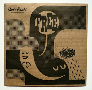
Don't Panic send out envelopes aimed at students filled with information packs and each issue includes a poster. Each time an pack is released a competition is held for designers to design a poster with only one word to work on. Our word was "vogue" and we were asked to design 3 main posters based on this word and 30 design treatments. I have to then pick out the most successful one and put it on the don't panic website for the general public to vote for.

Sunday, 17 January 2010

Ian Curtis 100 opinions.

Here are a few selected
opinions of Ian Curtis.

1.He's a poet. It was a shame no one took his lyrics seriously.
2.Everyone has their own opinions. It depends on your own personal definition of genius. To me, he was a musical genius,
the inventor of post-punk. And yes, he is the #1 emo.
3.Why is he called a genius? Isn't he ABIT overrated? Random extravagant lead singer killed himself... gifted? Maybe.
But FAR FAR AWAY from being a genius.
4.Ian Curtis: true artist, way ahead of his time.
5.Probably the single most influential person to the Post-Punk genre.
6.Heroes don't kill themselves, except they are inspired from a japanese mythology... he's just like curt cobain...
a victim,nothing more.
7. The guy had a simply phenominal voice
8.hes a hard man to explain isnt he. hes a complicated soul, but brilliant. I think he had big dreams but little motivation.
He had a way with words, phrasing things delicately.
9.Hate.
10.He was about death,bleakness and darkness.
11.Indie bands nowdays either have a generic indie sound or are poor imitations of Ian.
No one can match that poetry.
12. He was a crap dad and a crap husband. Not exactly a role model. But an inspiration? Yes.

100 facts Ian Curtis.


Ian Curtis facts.
1.Born 15th July 1956
2.Died 18th May 1980
3.vocalist and lyricist of Joy Division.
3.Was a fan of David Bowie, Lou Reed, Iggy Pop and Jim Morrison.
4.sang in a bass-baritone voice
5.Married Debrah Woodruff 23 August 1975, when he was 19 and she was 18
6.Had a daughter with Debrah named Natalie.
7.In 1976, Curtis met his futurer bandmates,Bernard Sumner and Peter Hook,at a Sex Pistols gig.
8.From his high school days, his ambitions and hopes were focused on the pursuit of art, literature and, most importantly, music.
9.Hung himself in the family kitchen with the washing line.
10.Had an affair with Annik Honore.
11.Ian was obssessed with artists who sung lyrics about death.
12.Was a follower of "Live fast die young"
13.Ian took an accidental overdose of chlorpromazine hydrochloride.
14.January 1979 Ian was diagnosed as epileptic
15.Was 23 years, 10 months and 3 days old when he hung himself.
16.His grave stone was stolen in July 2008 from Macclesfield cemetery.
17.Has the lyrics "Love will tear us apart" engraved
18.His headstone has the inscription "Ian Curtis 18 - 5 - 80" and the lyrics "Love Will Tear Us Apart"
19.Ian's widow, Deborah, penned a biography of her late husband in 1995 titled 'Touching from a Distance.'
20.Suffered from epilepsy and depression. Several times in his life he had to be carried offstage due to epileptic seizures
he suffered during concerts.
21.His second (and final) album with Joy Division - 'Closer' - is considered one of the darkest and most haunting albums in music history.
The lyrics largely document Curtis's emotional turmoil leading up to his suicide.
22.He was found hanged in 1980 with Iggy Pop's "the idiot" still spinning on his turntable.
23.Would now be 53 years, 6 months and 2 days old if still alive today.
24.worked as a civil servant for the government department.
25.Shortly before the end of Ian's life, his wife Deborah had started divorce proceedings and Ian was
no longer living at the family home.
26.In April 1980 Ian was admitted to hospital after taking an overdose of his epilepsy medication.
27.Watched Stroszek, a film by Werner Herzog before hanging himself.
28.Killed himself on the Eve of their american tour.
29.Lived at 77 Barton Street Macclesfield with his wife and daughter.
30.Curtis's last live performance was on 2 May 1980 at Birmingham University,
31.Digital was the last song of his last live performance wih the band.
32.Although predominantly a vocalist, Curtis also played guitar on a handful of tracks.
33.The name "Joy Division" stemmed from the sexual slavery wing of a Nazi concentration camp in the 1955
novel The House of Dolls, and was thought to have been pitched by Curtis.
34.Deborah Curtis wrote Touching from a Distance, published in 1995, a biographical
account of her marriage with Ian, detailing in part his infidelity with Annik Honoré.
35.A wall on Wallace Street in Wellington, New Zealand, had the words "Ian Curtis Lives" written on it shortly after the singer's death.
The message is repainted whenever it is painted over.
36.Experience of epilepsy in himself and others inspired him to write She's Lost Control.
37.At the age of 11 Ian won a scholarship to the King's School in Macclesfield.
38.Was born Ian Kevin Curtis.
39.Grew up listening to The Who and The Rolling Stones, and other heroes of his teenage years.
40.Was 6' 1" tall.
41.Ian first discovered that he suffered from epilepsy in December 1978, while his wife was pregnant with their daughter Natalie.
42 Had attempted suicide before and failed.
43.The day following his suicide attempt, he performed with Joy Division at Derby Hall
44.leading up to his suicide He wrote a letter to his wife Deborah, which spoke of the troubles in his life,
and the love he felt for her and Natalie.
He did write that he wished he was dead, but did not speak of any intentions to kill himself.
After this, he is believed to have taken photographs of his daughter and wife down to look at
45.Is portrayed by Sean Harris in 24 Hour Party People (2002).
45.(personal quote) "All my lyrics are open to interpretation by the individual and imply many different meanings, therefore
their relevance is purely subjective."

Followers

About Me

My photo
Simon Cherry.Im 19 and I practically have a mortgage.I'm currently studying a BA hons in graphic design at leeds art college.I like the simple things in life.If tea were an alchoholic beverage i'd be off me face constantly.Buy me a pint and i'll be your best mate,Honest. The development process and journey of graphic design is my obsession.